I am happy to report that I have given my gallery wall a slight face lift. In June of last year I did a post about our gallery wall. Here's a brief refresher:
Ever since I wrote that post, I have been toying with the idea of "neutralizing" some of the art on this wall. Lately I've been more and more inspired by simplistic designs and I've found myself gravitating towards cleaner lines and fresher color schemes. So, I went for it! Out with some of the darker/bolder colors, and in with fresh clean neutrals!
Pretty subtle, huh? Can you even tell the difference? Let me make it a little easier for you:
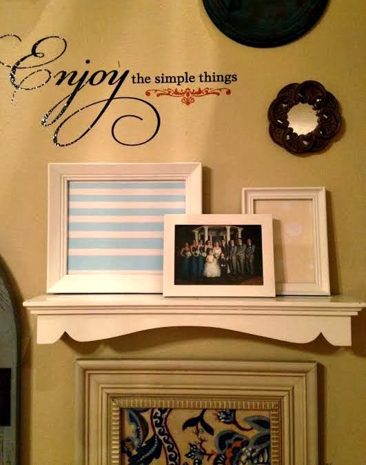
I painted six of the frames white and swapped out some of the art in those frames. I would have painted even more but my hubby said he likes the color, and didn't want me to get carried away. Here's a side by side comparison:
Like I said, subtle. But I think it looks so fresh and so clean, clean. I'm enjoying the change.
The striped art in the 8x10 frame and the polka dot art in the 5x7 frame I created for free using PicMonkey. It was simple, but I think it looks so much brighter than what I had there before (which was this):
Here's a bit more eye candy for you:
What do you think? Does it look fresh and updated, or were you a fan of the colorful art?
As always, thanks for taking the time to stop by!
Jesse


Love this!!!! It looks so much cleaner!!!!!
ReplyDeleteThank you! :)
Delete